
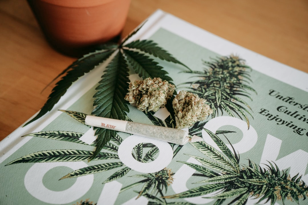
This is a case study for my capstone project that I completed as part of my education at BrainStation. I designed and produced a cannabis journaling app for users that want to track, rate, and educate themselves about the cannabis products they are using. It showcases my entire UX process, research, planning, ideation, design, and high fidelity production.
Challenge
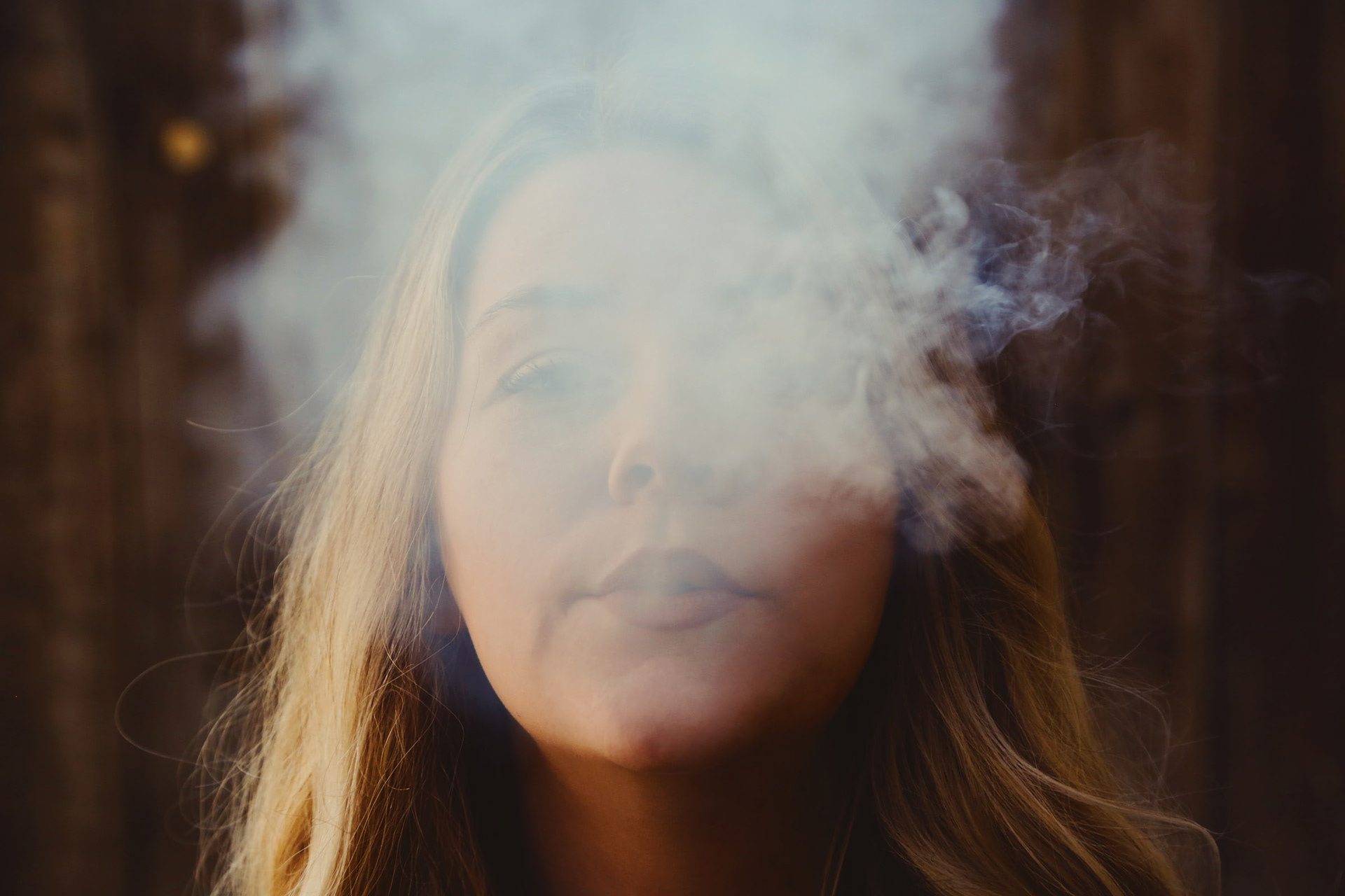
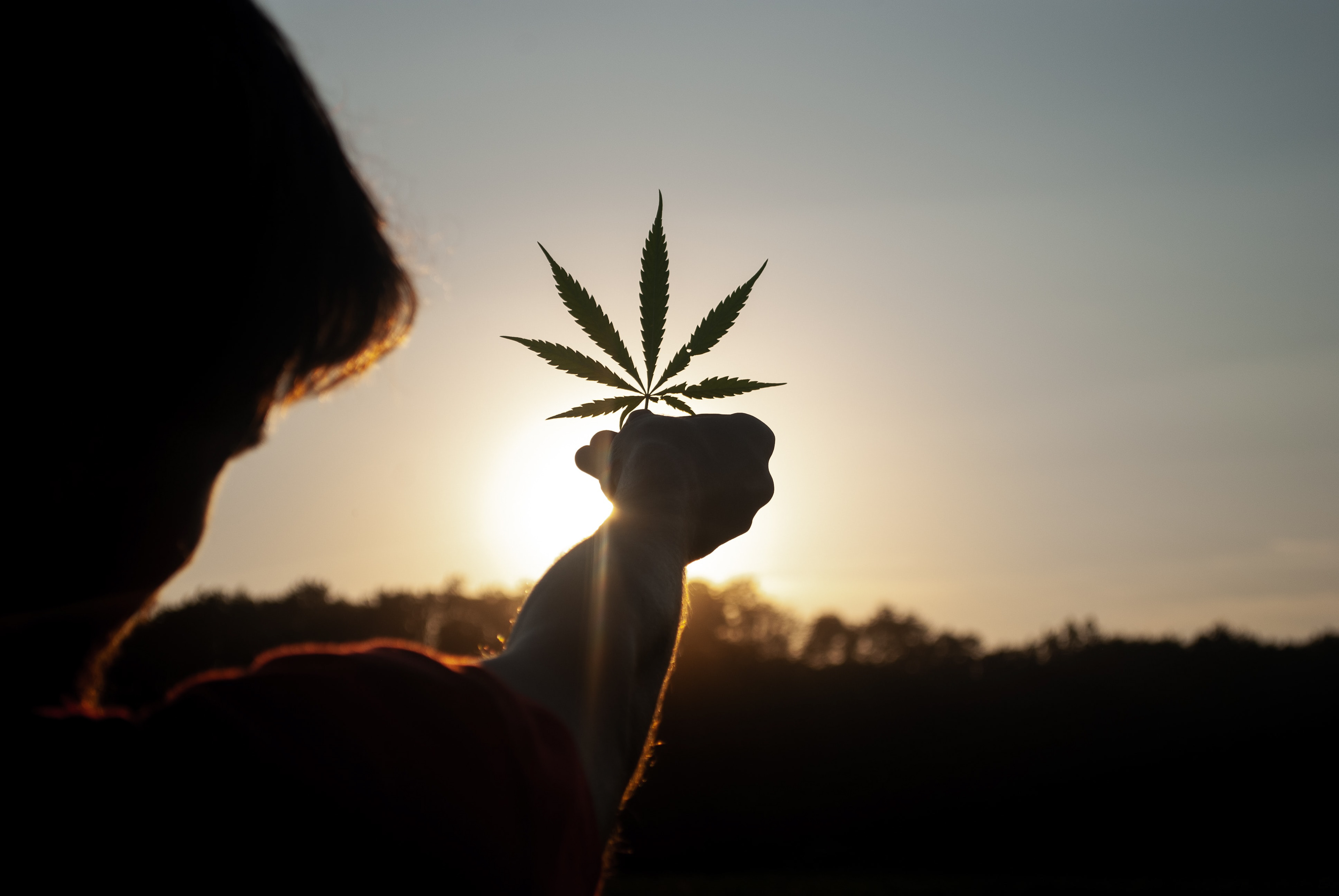
Since its legalization in Canada in 2018, cannabis users have been faced with an ever-growing array of products to choose from. Many people experience hesitation due to a lack of knowledge of the cannabis products they are buying.
I took on the challenge of using UX research and design to help solve these issues.
ROLE
Role: UX Researcher & Designer, UI Production
Timeline: 2 months
Platform: iOS Mobile App
Timeline: 2 months
Platform: iOS Mobile App
APPROACH
Secondary Research
Primary Research Interviews
Affinity Mapping
User Experience Mapping
Wireframe Development
UI Research & Development
User Testing
High Fidelity Production & Deployment
Primary Research Interviews
Affinity Mapping
User Experience Mapping
Wireframe Development
UI Research & Development
User Testing
High Fidelity Production & Deployment

RESULTS
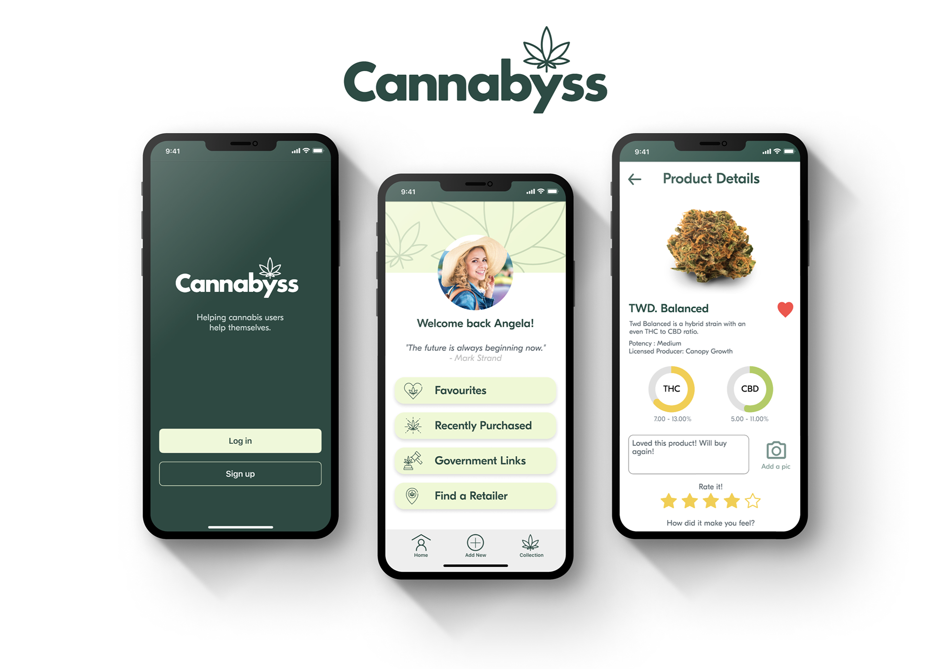
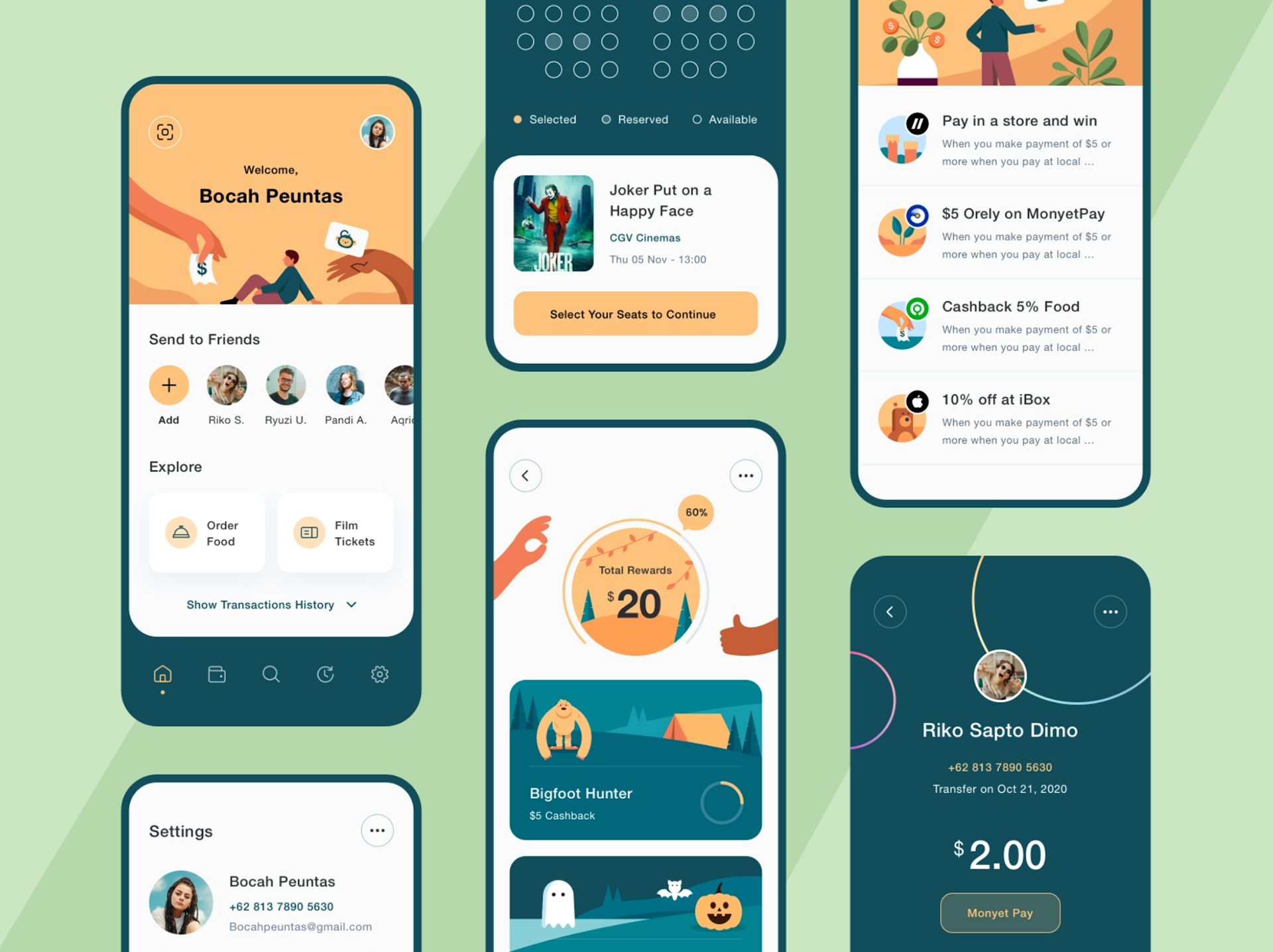
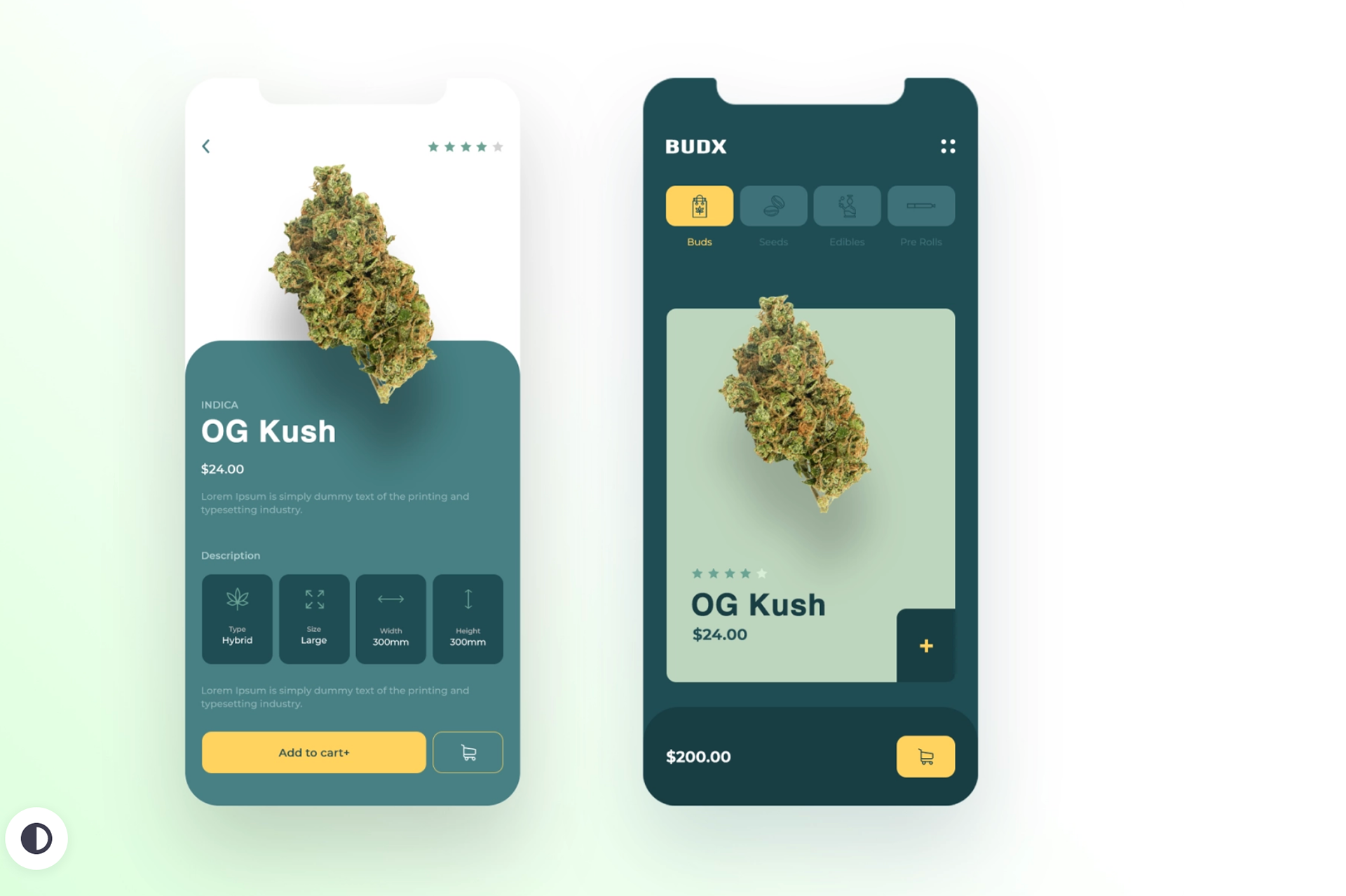
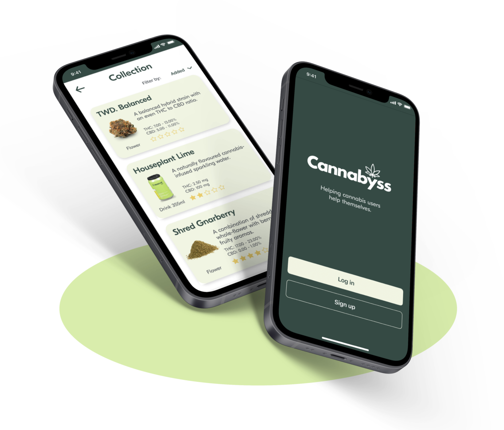
Cannabyss uses quick product entry and simple cataloging to track products the user has tried.
It empowers users of any experience level to teach themselves about which cannabis products they prefer so that they will have confidence in making purchases in the future.

Secondary Research
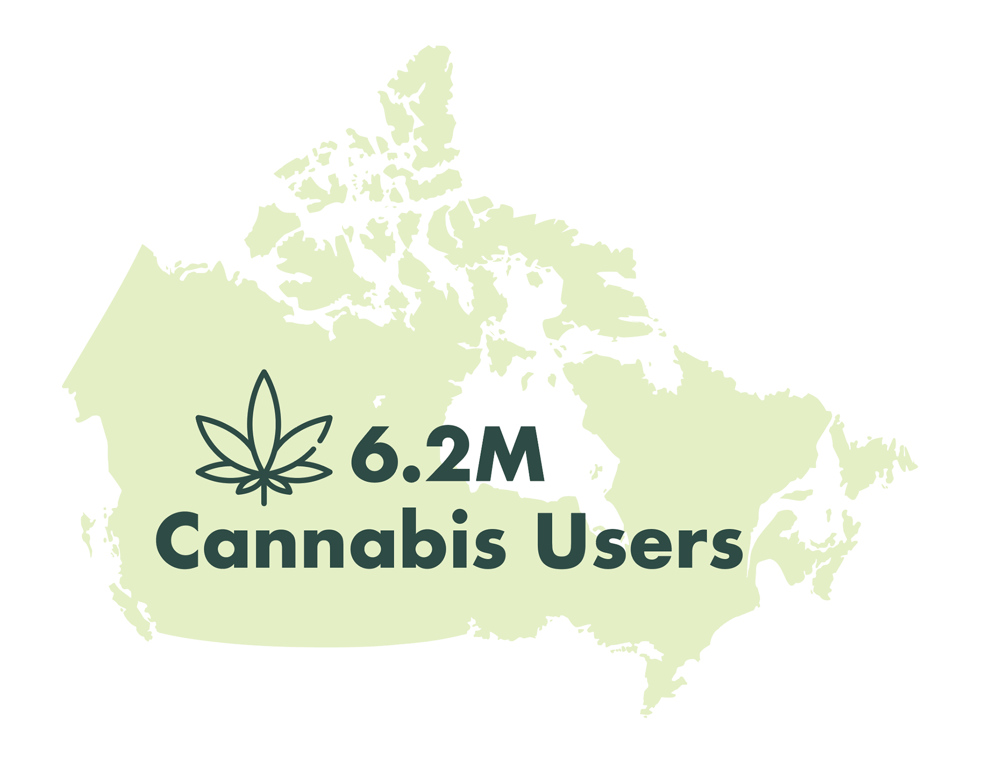
Through extensive secondary research, I learned that there is a large information gap for many cannabis users. 25% of users across Canada had no idea how strong the products they were buying were. With 6.2M users across the country, that is a huge opportunity for me to develop a product that can help people learn more about what they like and what to buy next.
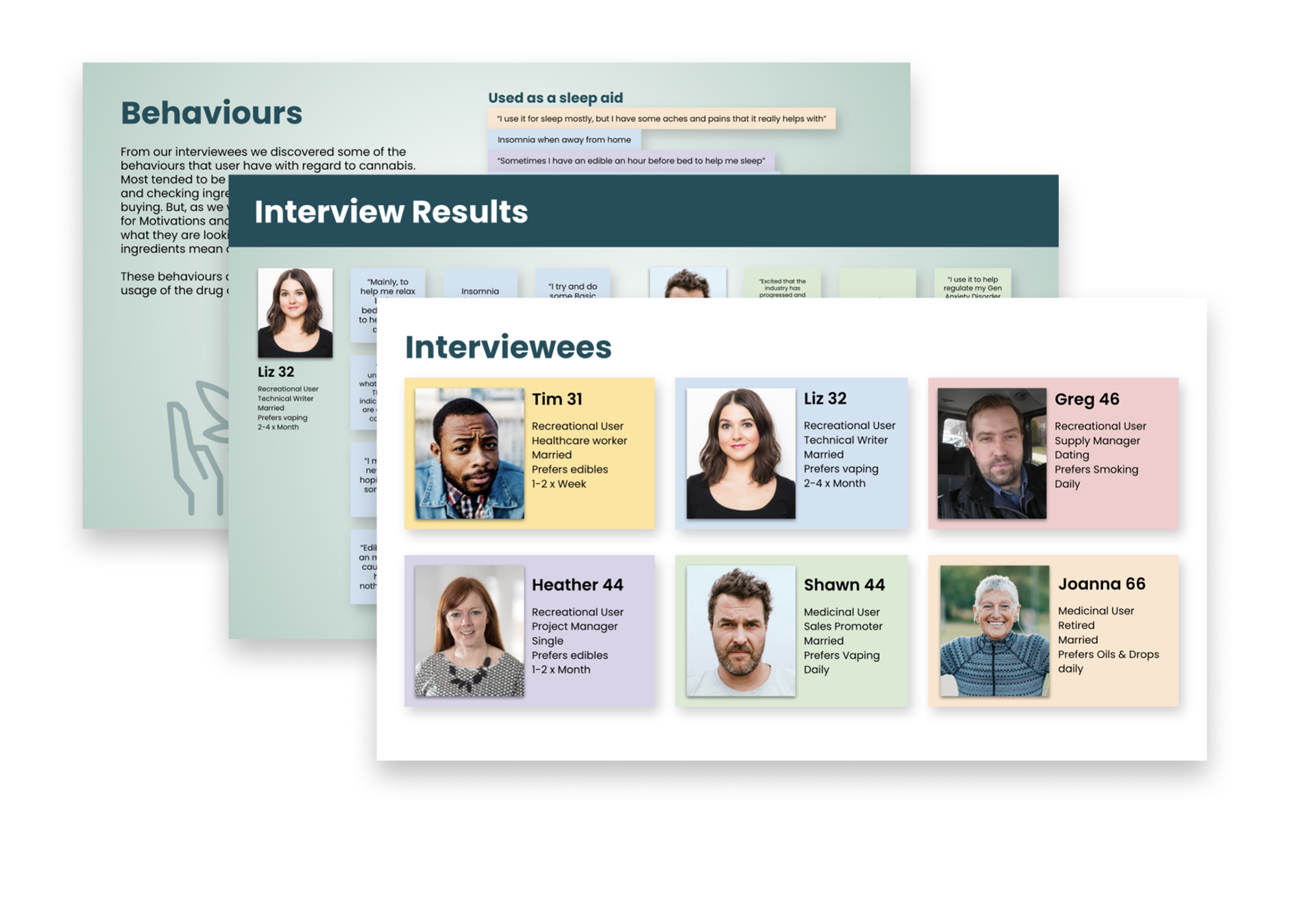
Primary Research
I conducted an array of interviews with multiple moderate cannabis users across many demographics and synthesized all of my findings. Using the interviewee's pain points, behaviours and motivations I found two main themes: Users don’t understand the active ingredients in cannabis, and users don’t know what the strength listed on the packaging means.
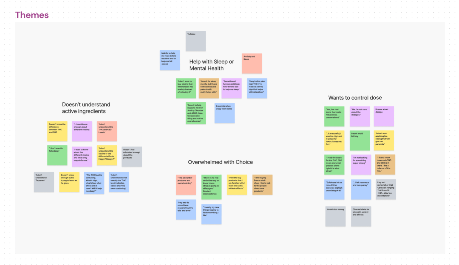
Theme Synthesis
Themes & Epic
Using the themes that percolated up out of my primary research, I created a variety of user stories to gain insight into how a digital solution might help users. These user stories then informed my main Epic which was "Learning to control your experiences with cannabis". This in turn led to my "How might we...?" question.
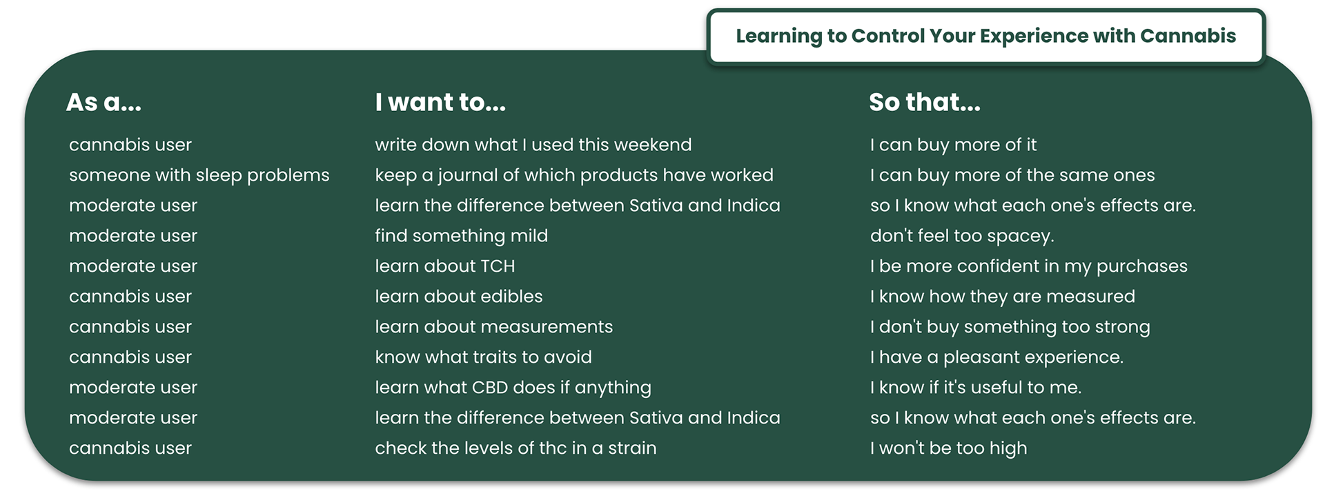
How might we help educate cannabis users on product details related to its effects so they will
have a pleasant experience?
have a pleasant experience?


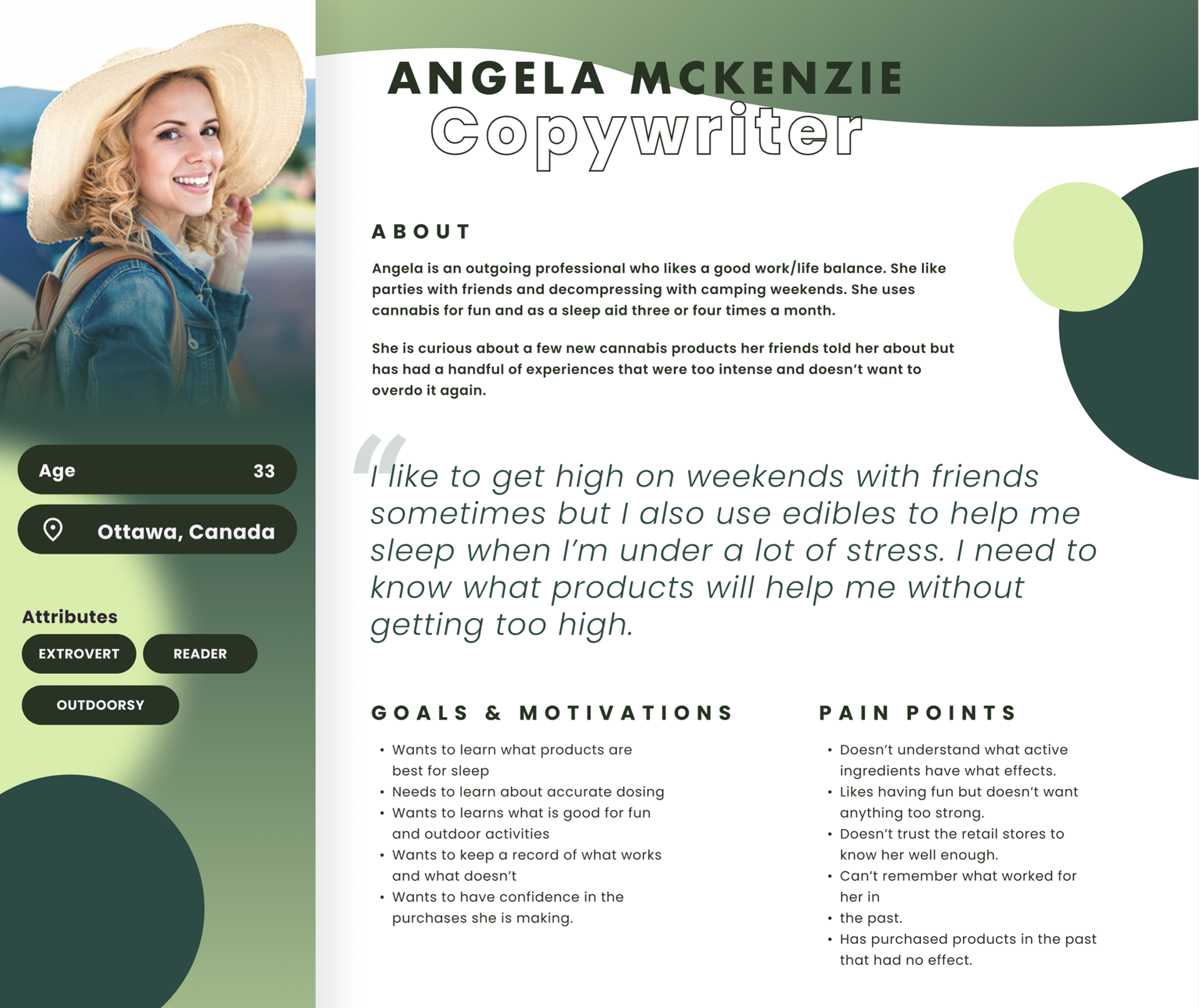
Persona
In order to start finding solutions to my "How might we" statement, I had to create a fictional persona that represents all of my interviewees, anecdotal experiences, and cannabis users at large.
Meet Angela McKenzie. A mid-thirties copywriter from Ottawa. She likes camping with friends on weekends and uses cannabis casually a few times a month for pleasure or to help her sleep.
Persona
Opportunity Selection
I used Angela McKenzie to create an experience map around the purchase, use, and product opinion of cannabis. By carefully exploring all the steps along the way, I found key points in the experience that could be valuable opportunities for me to build a digital product in order to assist her (and all the users like her). The key opportunities lie in helping people know more about products before purchasing and being able to keep a record of the products they have tried in the past so they can learn from their experiences.
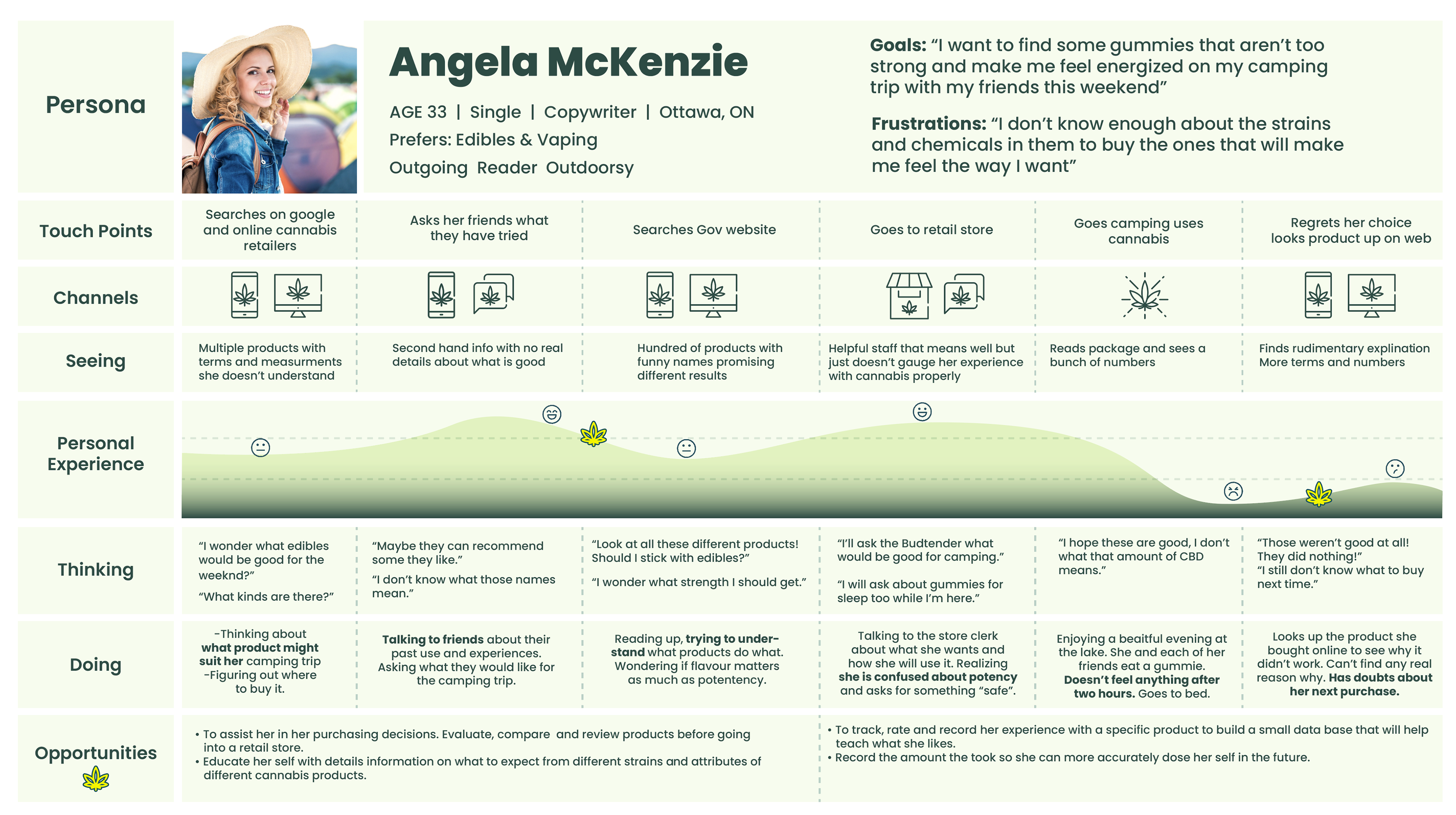
Experience Map
Task Selection
I built a simple task flow for Angela to follow in order to guide my creation of wireframes. One in which she enters a new product with an easy-to-use barcode scanner and adds the product to the “collection”. After she has used the product, she favourites it, rates it, leaves a comment, and leaves feedback on how it made her feel.
In the future development of the product, users will be able to filter all the products they have tried by any of these variables so that they have quick access to a particular set of data so it can help guide their future purchases.
Wireframes
This app needed to feel youthful and friendly. Although it will be used by people of all ages (above 19) it had to be professional yet playful to a degree. People are using cannabis for fun and because of that their experiences matter to them and they take their product choice very seriously. I believe the feel of this app should reflect that.
With this in mind, I began sketching solutions that reflect apps that Angela’s demographic is familiar with. Social apps, helper apps, collecting apps, these are all products that people use in their daily life, and instead of creating something off-the-wall or new and unfamiliar I felt it was necessary to build a platform that felt welcoming and recognizable.
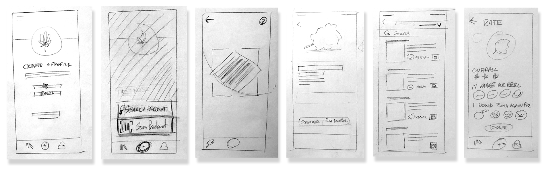
I brought my sketches to life by building wireframes that started to showcase some of the main features that I wanted to include in this product. Things like the barcode scanner, a simple card system on the collection page, the ability to like, favourite and leave feedback on specific products.
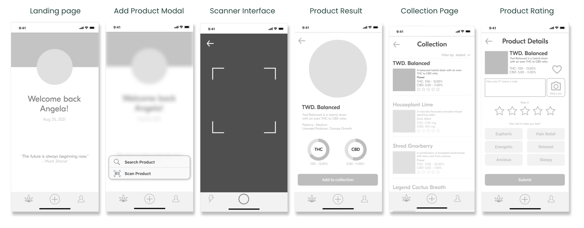
This process gave me clear guidelines for the layout of the screens. Designing a simple home screen that acts as a profile page was important. Since cannabis use can be very private, I did not include any social features but I want the user to feel like this was a personalized collection of their experiences. So having their profile front and centre on the home screen was important to achieve that. The inclusion of a daily inspirational quote was also important to me since many people use cannabis to feel better or even in a medicinal way. I feel these quotes help reinforce a health and wellness vibe for the opening screen.

Brand name
The brand name ideation was an iterative process in which multiple names were created, research for existing use, and vetted for anything “Off brand”. As you can imagine, the cannabis culture can go in many different directions, from hokey and cartoonish all the way to Corporate and medical. It was important to strike a good balance between the two and not only to be taken seriously but to be perceived as friendly and available to everyone.
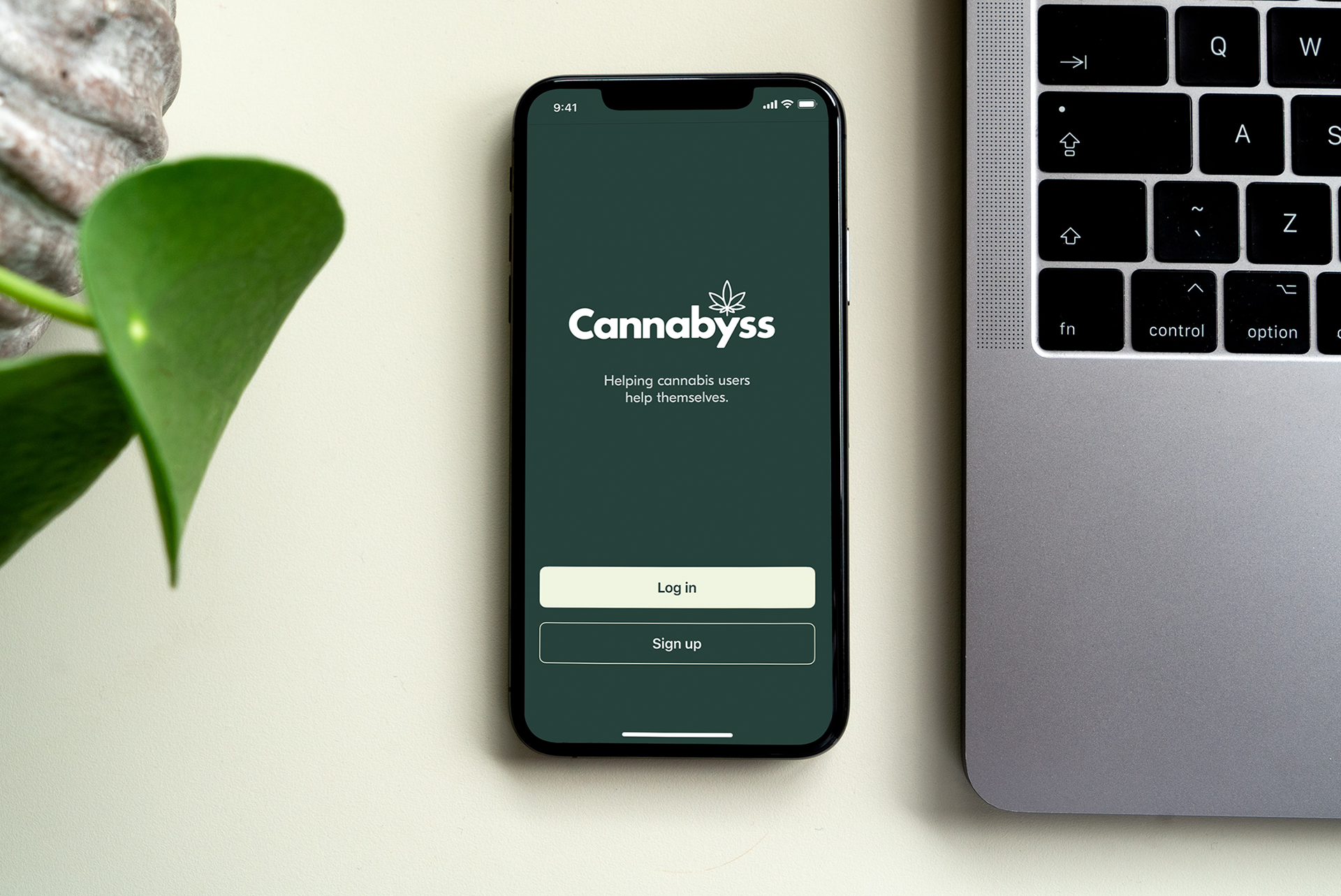
Ultimately, I decided on “Cannabyss” because it is concise, playful, and speaks to the vast array of products available to users and how this product might help them navigate them.
Wordmark
The wordmark was a challenging but extremely fun exercise in brand identity and design skills. I tested many typefaces for this brand and firmly decided on a sans-serif typeface pretty early on. Not only because it is much easier to adjust letter spacing and other attributes, but because some of the brands that my persona is familiar with have San-Serif word marks. Paypal, Jeep, Google, and Spotify to name a few.
Brands familiar to my Persona
I choose Futura Bold because of its familiar nature and legibility at any distance. I closed the aperture of the capital C in order to lead the viewer’s eye into the rest of the word. I also slightly rounded the shoulders of all the characters to give the wordmark some ease and tone down the corporate nature of Futura.
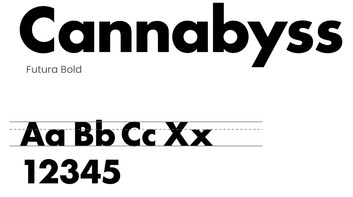
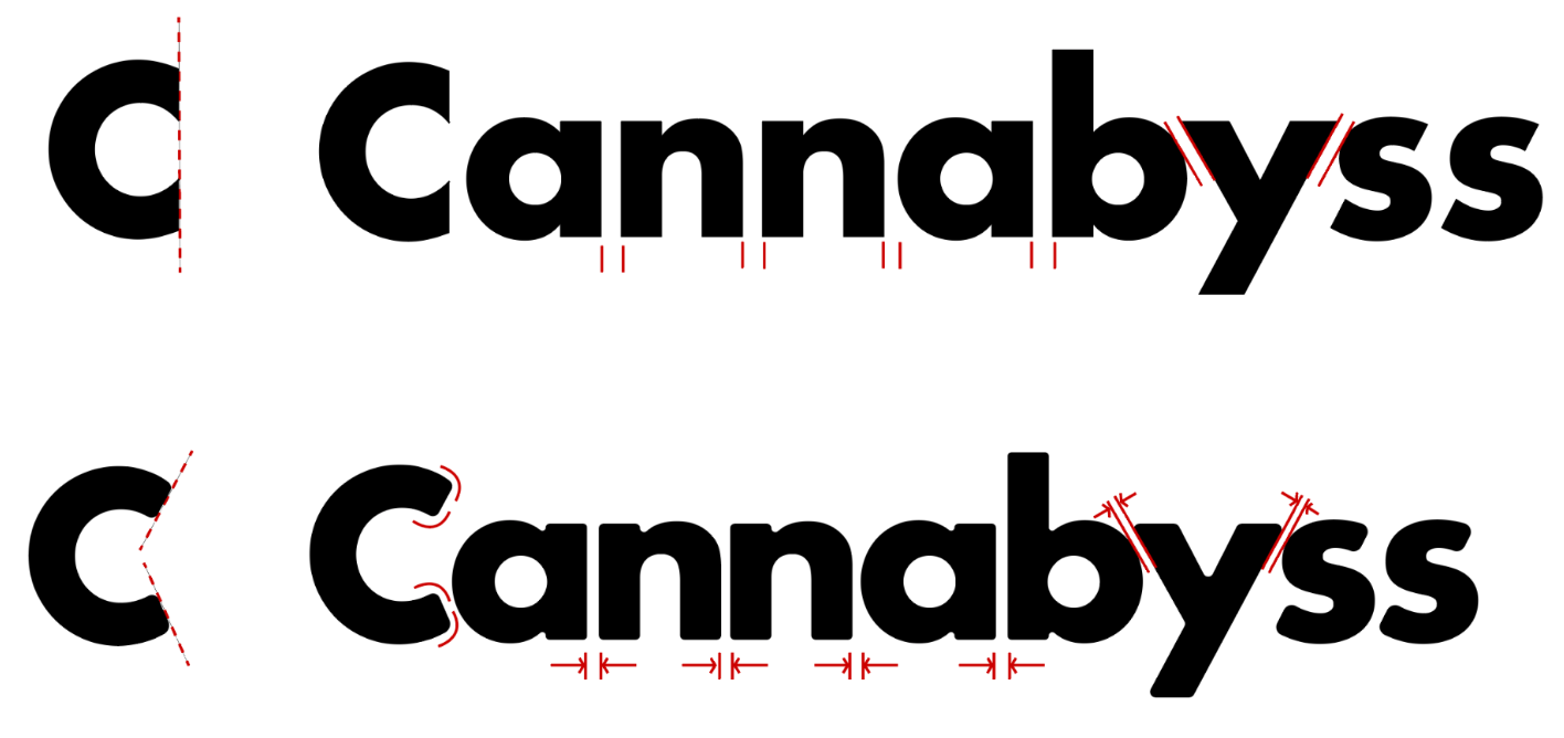
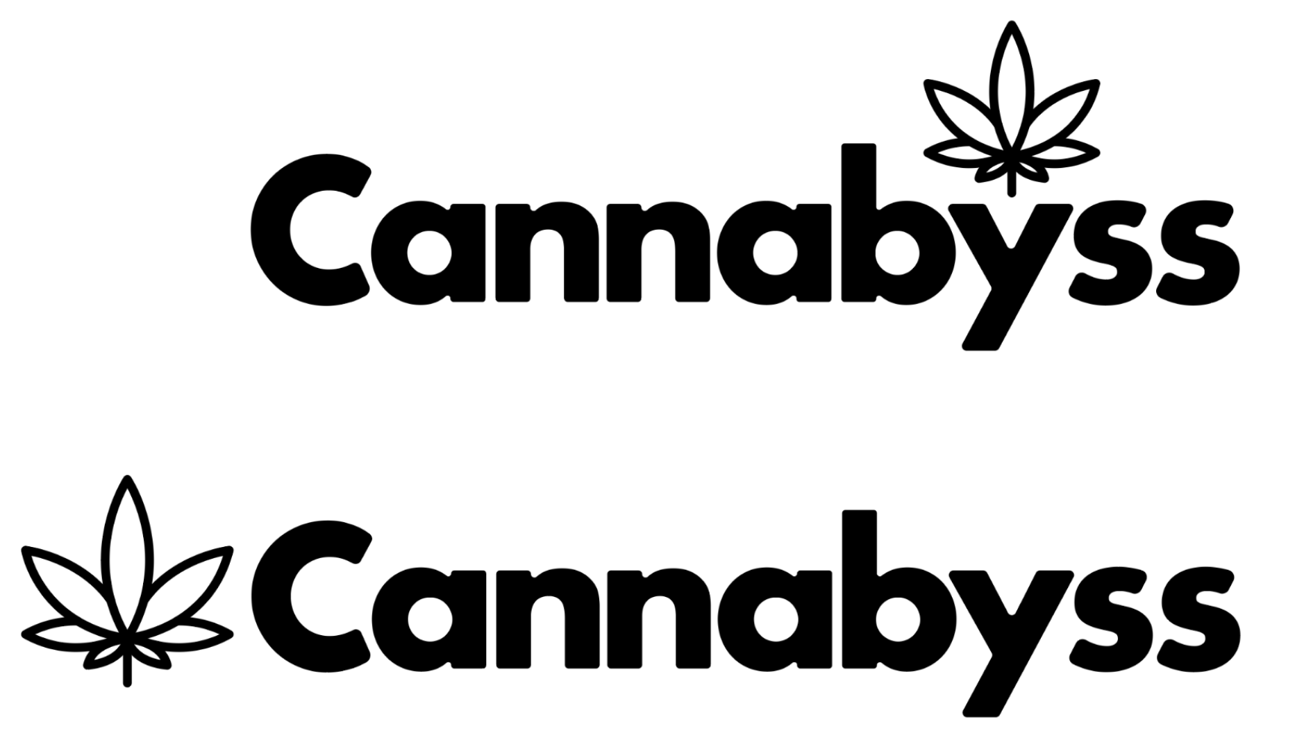
Finally, I included the vector of a simple cannabis leaf to keep the viewer aware that this product exists within the cannabis consumer industry. I also had plans of using it for animation at this stage which was successful as you will later see in my prototype.

Wordmark Exploration
Official Wordmark
UI INSPIRATION
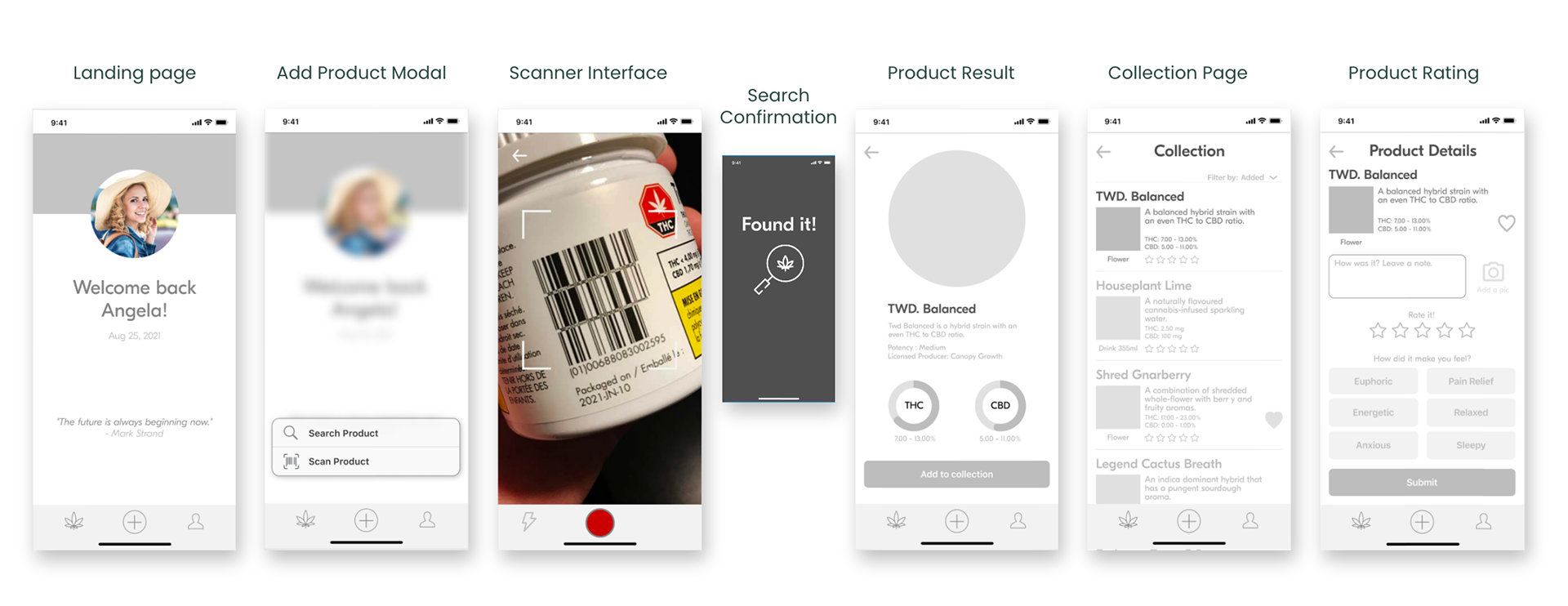
User functions and features were researched extensively. The implementation of a barcode scanner was essential for quick user input. I also decided on a simplistic card system for the collection page. System-wide decisions like rounding all corners, floating product imagery, relying heavily on neutrals for text, and outlined icons are all inspirations I drew from my UI board you can find here...
Centred Profile Page
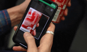
Barcode Scanner
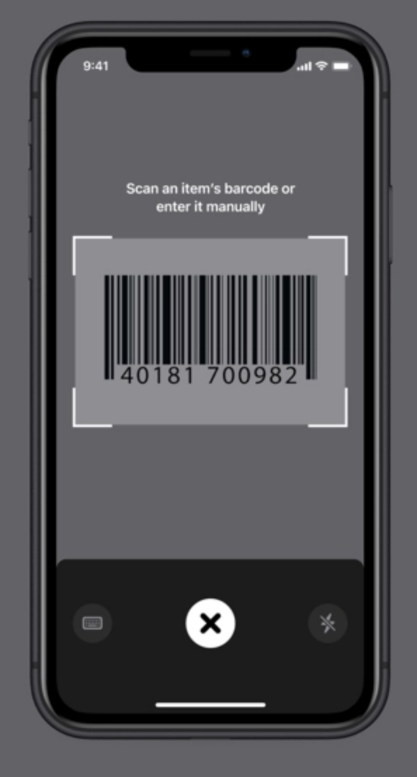
Barcode Scanner
Onboarding
Flat card design
Familiar interactions
Flat design and floating imagery
Simple rounded corners
MOOD BOARD
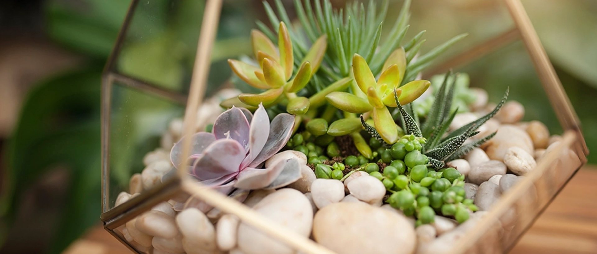
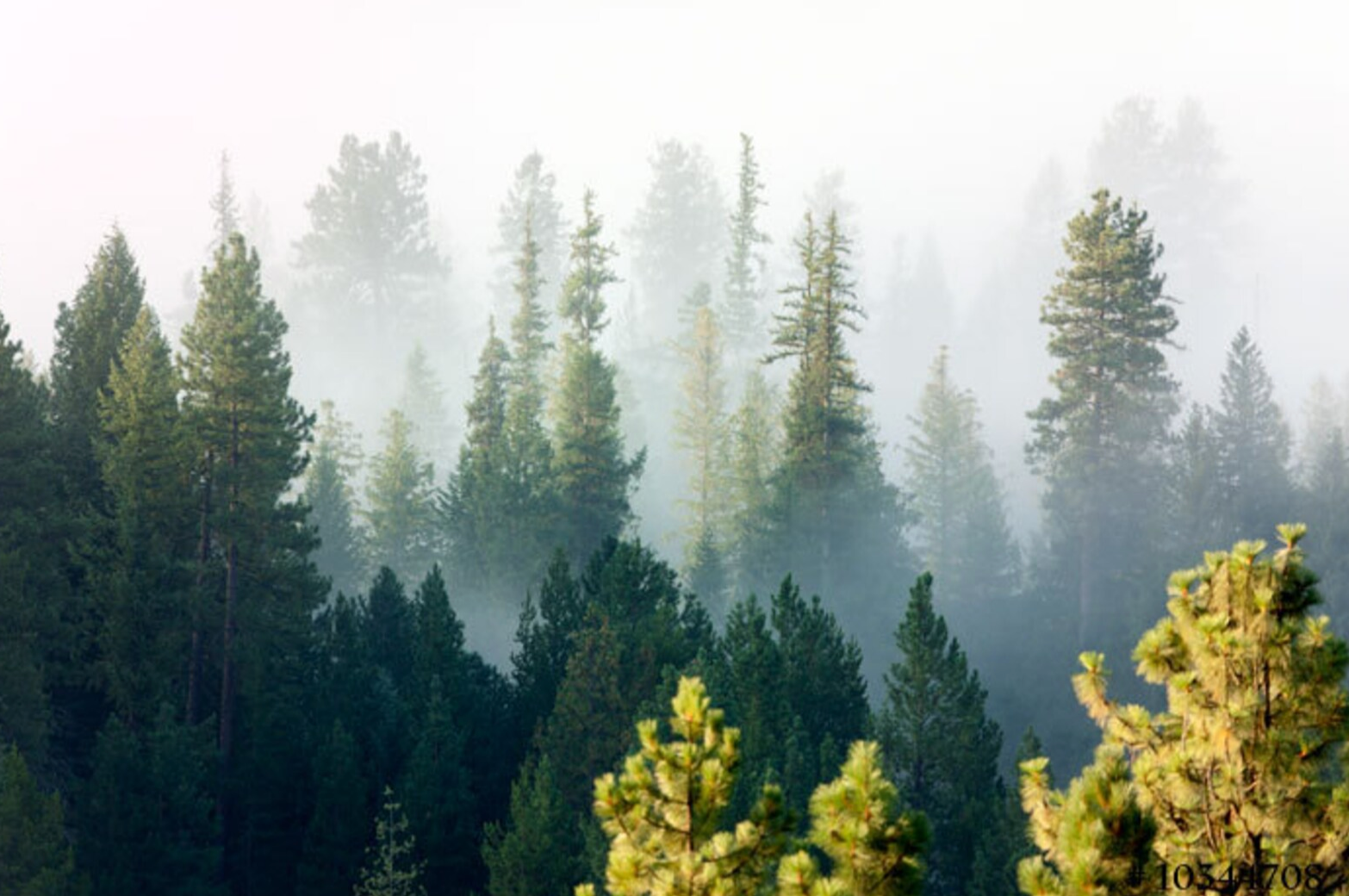
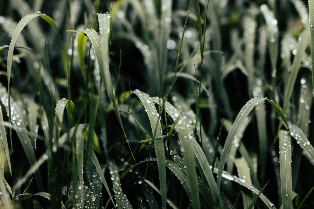
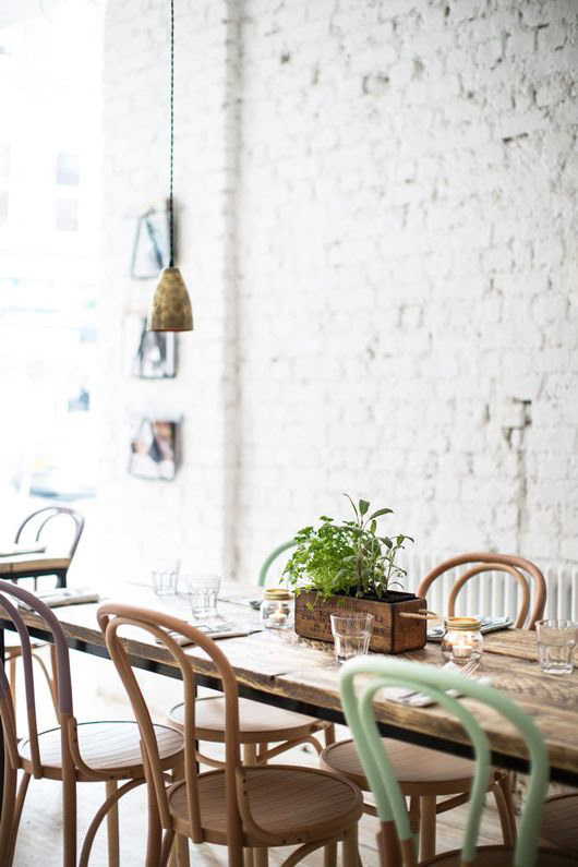
I based my mood board on my persona’s interests, hobbies, and lifestyle. Young and fresh, Angela loves the outdoors, 21st-century design sense, and minimal luxury. Using adjectives, ideas, and concepts such as Fresh, Modern, Motivational, Millennial, "Coffee Shop" and "Juice Bar" I was able to source some appropriate imagery and really start setting the tone for this app's visual identity.
You can view the entire mood board here...
You can view the entire mood board here...
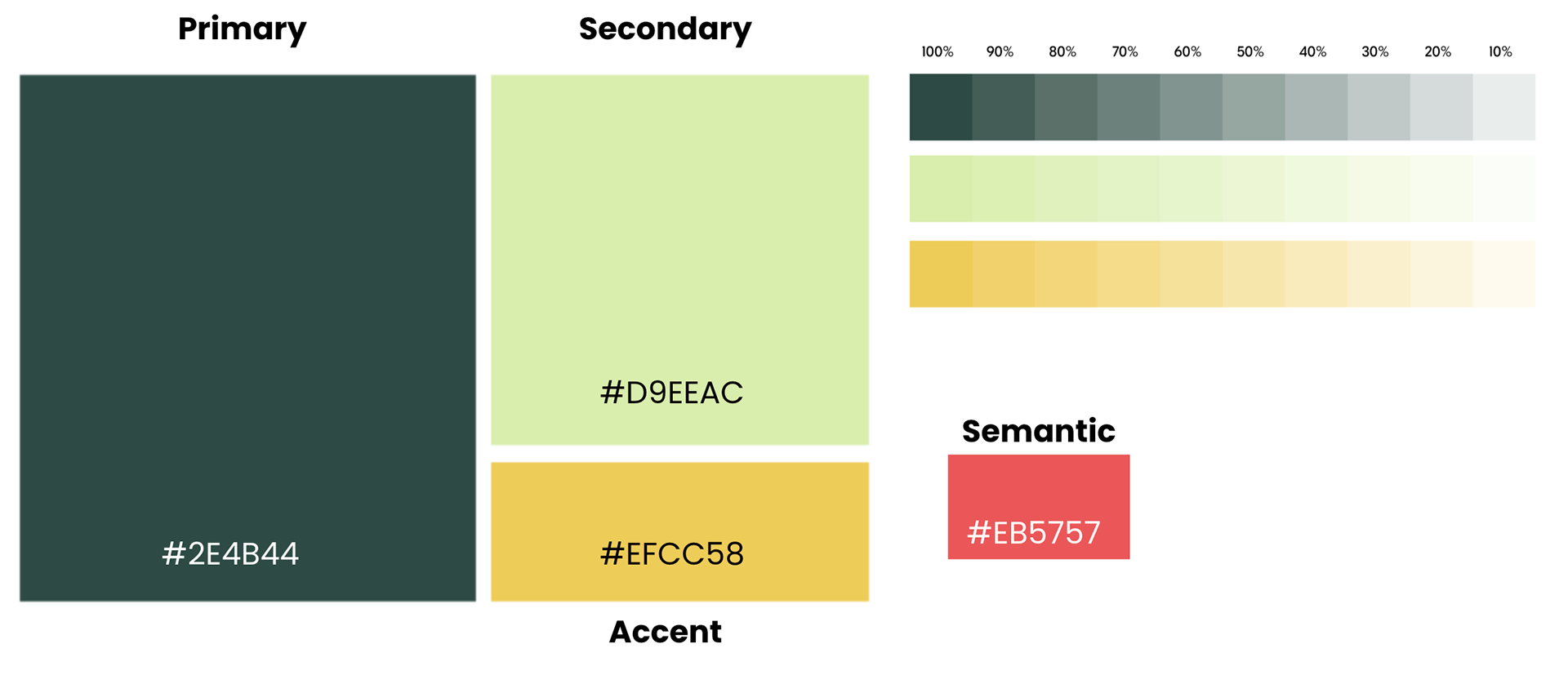
COLOUR EXPLORATION
Using my mood board, I collected various colour swatches and started the process of selecting primary, secondary, accent, and semantic colours. I knew that colours had to feel fresh as well as have good contrast not only with each other but with neutrals in order to be accessible.
For that earthy, modern cannabis industry feel, I decided to go with a green palette. Although somewhat obvious I chose a dark muted green with a softer, mellower green to help differentiate this product from other players in the cannabis industry. Most of which use vibrant cartoonish greens.

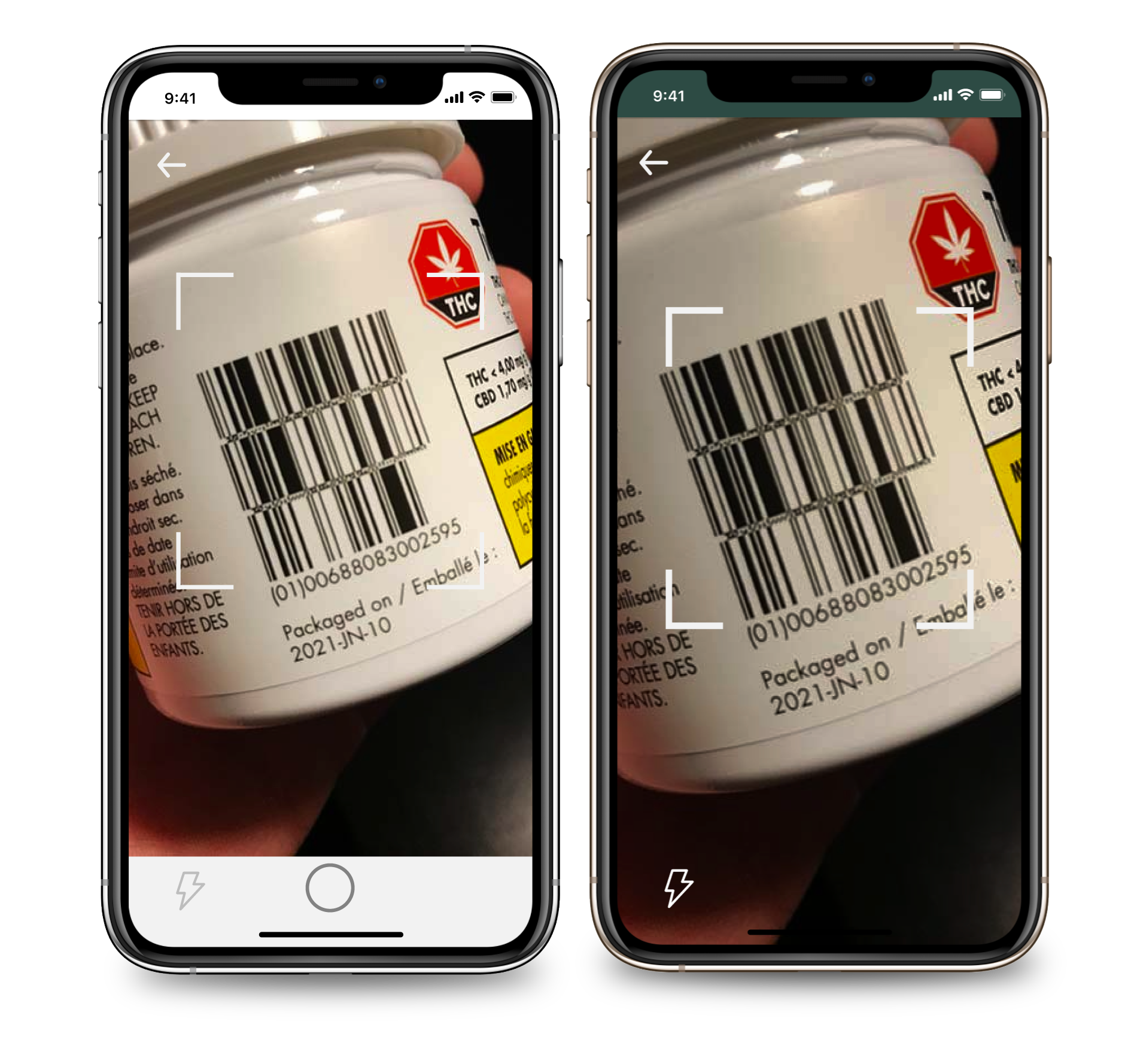
I conducted three rounds of user testing throughout the different stages of development using a varied pool of people that are all familiar with the iOS platform but most differed in their cannabis use. I conducted these tests using Zoom calls, online forms, and in-person having all the participants walk through a simple task scanning and adding a new product to the collection page. hen after the user has hypothetically used the product, navigates to the product page, likes it, leaves a comment, rates it, and enters data about how it made them feel.
Testing was a big success with the exception of one anomaly. People consistently clicked on the image when using the barcode scanner instead of using the capture button. After researching camera scanning behaviour, I came to the conclusion that barcodes and QR codes are automatically detected when framed in the view-finder on the user's mobile device. Once detected it takes them to the intended web destination. I then redesigned the interaction in my prototype to reflect that familiar behaviour.
After user testing and brand development were complete, I started injecting the colour and brand elements into a new grid-based build of the app. I followed the working model of my tested wireframes and built out better navigation and designed the front-end experiences with onboarding and logging in.
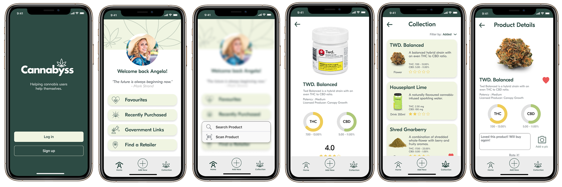
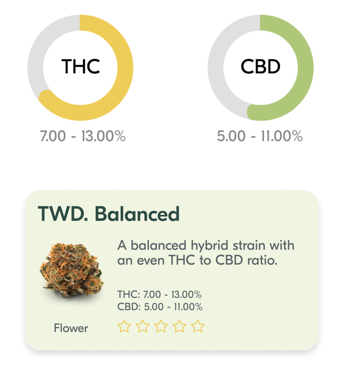
I created a few ways of visually communicating some of the attributes of cannabis products. One was simple text on each card that tells the user the percentages of the active chemicals in the product and the other was a circular graphic element that can visually show the user the amounts. I have future plans to animate these slightly when the product screen loads.
My icon choices were based on a great set of vectors that I found on vecteezy.com. I have utilized them in an outlined fashion to keep the design light and elegant.
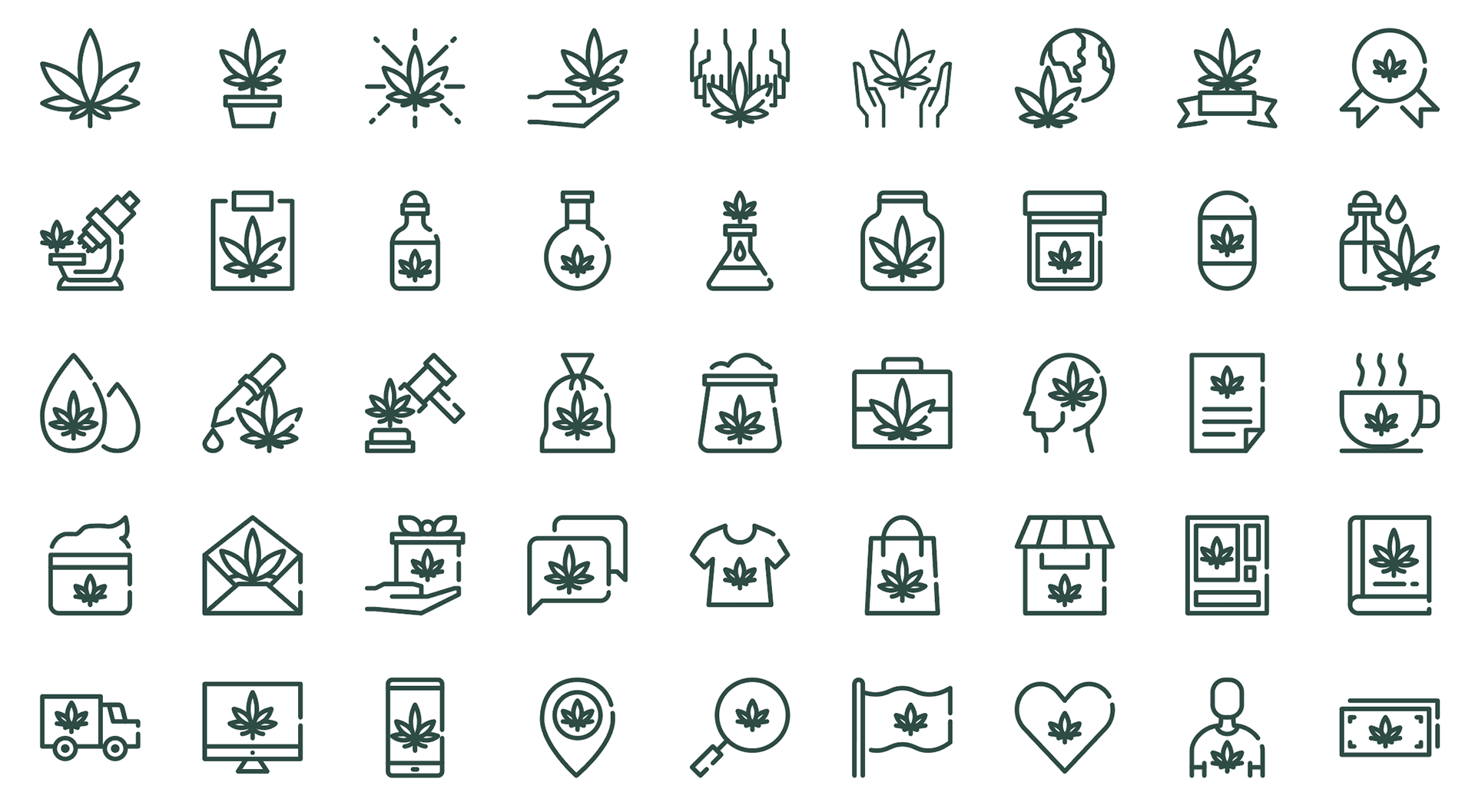
Icons by tkpstocker698418 at www.vecteezy.om

This is the current prototype of Cannabyss. Please explore its features and if you would like to follow through with my persona's task flow, the steps are as follows...
• Add a new product using the barcode scanner
• Add it to the "Collection" page
Then, after hypothetically using the product
• Tap on the new product on the "collection" page
• Mark it as a favourite
• Leave a comment
• Give it a star rating
• Leave feedback of "Euphoric" & "Relaxed"
• Tap done
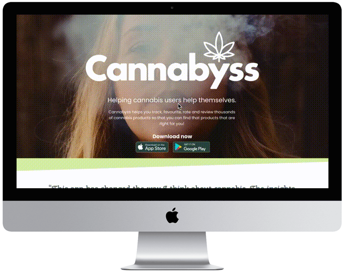
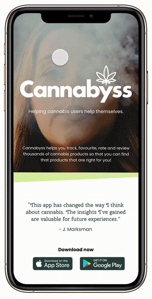
To explore this product from a business and marketing point of view I built a responsive website for desktop and mobile to advertise its features to potential new users. This exercise not only helped me understand more about designing for web but how to think about product deployment and engaging with the public to increase sales.
Through this build, I learned to control breakpoints for all elements and as well as relaying graphic and image placement for both platforms.
Having to expand on all the design decisions I had made in the development of the app up to that point was a learning experience in itself. It made me realize that there is a much bigger picture when setting out to design and build an app. It taught me to think down the road in terms of how my initial designs will get used in the future.
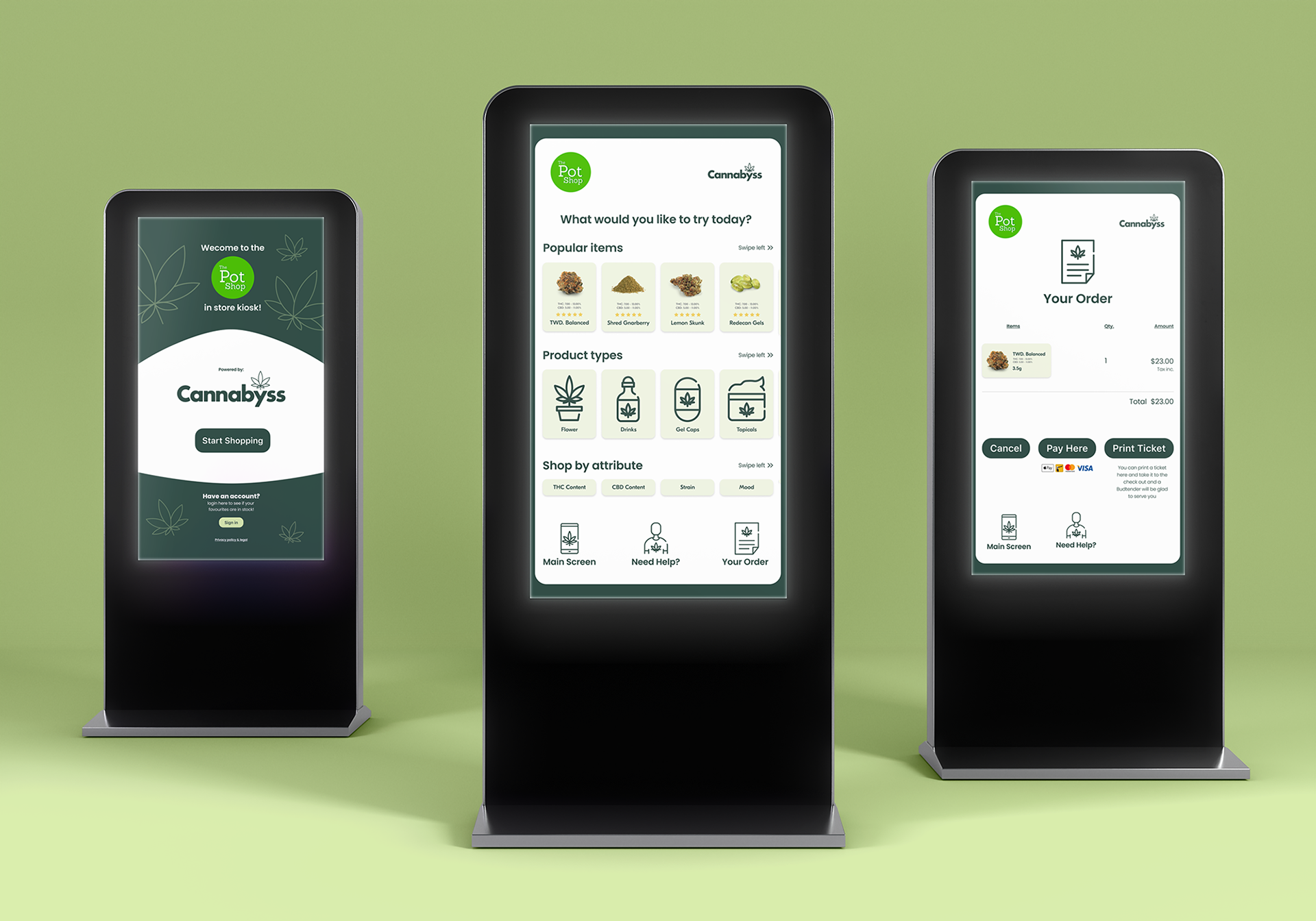
I wanted to see how this application could be used in different ways. It was limited by the private nature of cannabis use and I didn't see any need for it to be ported to a tablet platform since it can be useful for cannabis users while shopping. That Idea led me to think of a retail-oriented version of this application available in cannabis retailers via a kiosk.
The kiosk would be co-branded with the retailer but powered by the Cannabyss platform. This way any customer that comes into the store can use the kiosk to search that retailer's current stock, or, if a customer is a current user of the Cannabyss app, they can log in to cross-reference their favourite products with what that retailer has in stock.
The kiosk would be co-branded with the retailer but powered by the Cannabyss platform. This way any customer that comes into the store can use the kiosk to search that retailer's current stock, or, if a customer is a current user of the Cannabyss app, they can log in to cross-reference their favourite products with what that retailer has in stock.
Then they have the choice of either paying at the kiosk and picking it up at the counter or printing a ticket they can take to the counter in order to continue shopping from that retailer.
I have several ideas for features and design updates, changes, and iterations in mind for Cannabyss. As far as I took it, I see the potential for much more. Including researching and designing what the feedback method to users will be. I want to create a visual system that will compile all the users' favourites, ratings, and cannabis experience data to help them make purchasing decisions based on the results. This could be as simple as filtering and sorting on the collection page or as complex as generating graphs to map the different products they have tried and make predictions on others they might like.

My capstone project has taught me many things, chief among them the importance of time blocking and research practices that result in a sound foundation from which to build meaningful and relevant products. The research I did into the problem space within the growing cannabis culture taught me that people’s experiences are all different. That they want the products that are suited to them and that they require the tools to customize their experiences and enjoy cannabis in their own way.
Seeing my research results become real was a rewarding experience for me. I learned how to deal with unforeseen challenges, set realistic goals for myself, engage with peers, and receive feedback that improved my product. Most importantly, I learned that I can continue to create products that help people and design using human-centered behavior as my guide.